Thursday, 26 January 2012
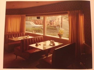
Stephen Shore- uncommon places. A book I want but costs a sorry 90 pounds plus
These photos of photos do not do them justice unfortunately but never mind. Just love how something so hostile and cold (the general subject of the photos in the book) can be lit so warmly. There are so many lines carefully aligned it's hard not to keep looking.
Got an app on my phone to increase likelyhood of blogging?
Twin project- my response to twins is basically the loud, outgoing, brave twin vs the shy, quiet and timid one. Feel the need to learn a little more about shadows...
Monday, 16 January 2012
A few things I have looked at since today's lecture
Tom Gauld
Here the light reflections on the trees and ground are done by working in reverse white on black. I love the contrast between the textured detail and the crisp white figures in the image that mirror the style of the moon. This makes the whole thing feel surreal which is appropriate for ghosts.
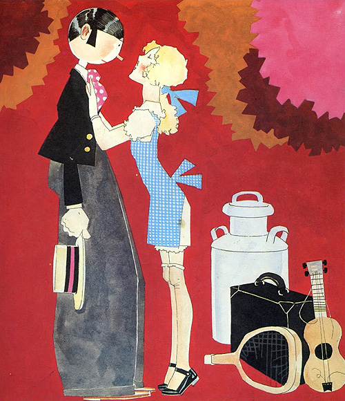
John Held Jr.
I chose this image as I like the contrast between the flat colour and the washy colours. I like the jagged edges and the fact that in some areas perspective and shading makes the image have depth while in others the flat colour makes it seem two dimensional.
Adrian Johnson
Screen printing and how the the colours create other colours as the ink is laid on top - interesting.
Another screen print, here with the imperfections of the print left in. I like the ever so subtle reflection on the ground which only exists as it is raining and there are puddles. This aids the central theme of the image without actually having to drawing a miserable day in the background and puddles on the floor. The exaggeration of how small the umbrella is emphasises just how bad this guys day is going!
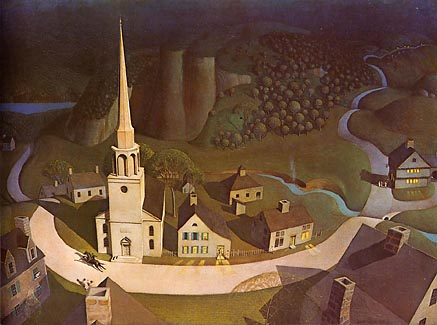
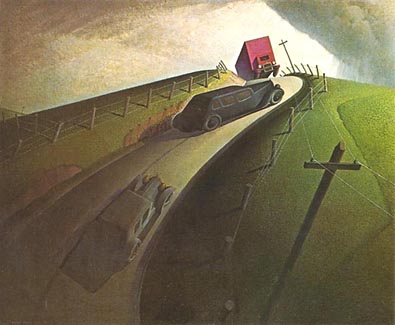
Grant Wood
Love the use of light on both of these. The warmth of the colours in the images is apparent despite them not being filled with reds and oranges.
Wednesday, 7 December 2011
Event Posters, getting ideas...
Designed by Tom Eckersley for an exhibition with the tag-line: How they brought the world to the West Coast.
I like the way the sea and sky are one, the horizon being defined by the land mass in the background. Notice the weight of the line between the beach and sea getting thinner in the distance; this is a good way of giving the picture depth whilst still keeping the simple flat colour. The white boat is also essential to the composition as it draws the eye back in to the image and breaks up the large amount of blue. The blue underlines in the bottom left also balance out the colour making it look less top heavy.
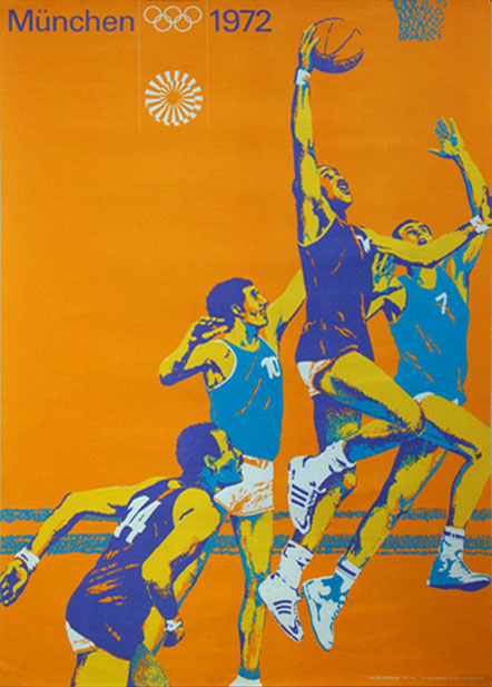
Designed by Otl Aicher for the Munich Olympics, 1972. Part of a series.
I have been interested in how I can eventually make my ideas into a set of four rather than individual pieces that don't sit well together. Here Aicher has used the posterized style of the photographs to give the posters consistency. The same font is used for each poster and although the colours change, the is a limited palette on each. The same shades are also sometimes used from one poster to the next adding to the consistency and the Olympic rings are kept a single colour as to not distract the viewer.
I like how each poster conveys the mood of the particular sport. In the first one the lines in the back ground as speed to the cyclists. In the second the shadows on the arms elongate them and exaggerate the arms extention giving the feeling of desperation to get the ball. The juxtaposition of the bodies combined with the bright colours additionally shows the energy of the moment. The third image contains much more stable shapes within its composition, for example the rectangular block colour for the body of the Archer. Again this reflects the sport shown.
Sunday, 4 December 2011
Thursday, 17 November 2011
Subscribe to:
Posts (Atom)