Wednesday, 31 July 2013

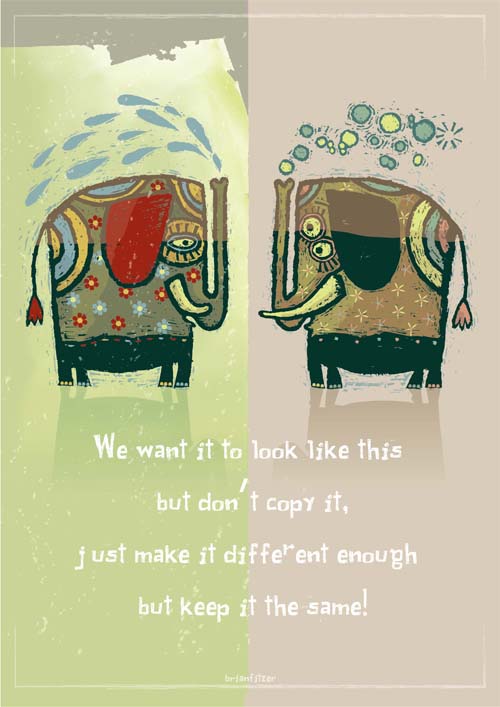
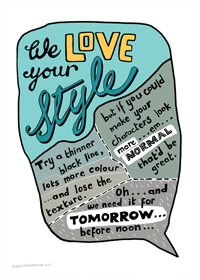
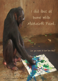
Client Feedback Posters

Frustrated by their clients, Irish graphic designers Mark Shanley and Paddy Treacy decided to turn their “favorite worst feedback” into posters. www.sharpsuits.net


Thursday, 14 February 2013

Animation Inspiration

I am looking at infographic animations for ideas on tone of voice and aesthetic for my animation. I am also interested in the way one screen can merge interestingly into the next screen and a new pocket of information.

Loud Voices pt. 1 - Laguna San Ignacio


I have selected this video as I like the visual aesthetic. It is a quite slow paced (slower than the animation I imagine creating) however the camera moves across the scene to show different pockets of information. I like the fact the type pops like bubbles underwater. It becomes part of the animation rather than an overlay.


All of the Presidential Election


This animation has a really interesting flow. Things spin, pop, bounce and slide in and out of the frame and objects transform into one another. The circular axis that has been created in the centre not only allows things to spin around it; elements are able to shrink into the centre and expand into something else. The animation has a happy positive feel to it, however, it is in a foreign language so I cannot tell how the information relates to the image.

Herman Miller - This is You


I have seen this animation before so it must have stuck in my mind. It is really simple and effective. Elements in the image have a cut out, rough-edged feel making it seem personal. This is appropriate for the theme of the video which focuses on the audience - 'you' - making oneself better off by coming to work for Herman Miller. This also gives the animation a feeling of eco friendliness which is also raised within the clip. There is a repeated use of the word 'this' as simple objects flash into view which seems to work. The movement within mimics the speed and tone of the voiceover- an important thing to think about. 

http://vimeo.com/15869378

This Is Dare


This is another self promotion video like the Herman Miller video above. Instead though, cleaner lines are used and digital text. This reflects the fact it is a design company, focusing on the digital. The camera pans in the clip which again makes each piece of information flow on from the last. It creates a sense of dynamic as although it is the camera that panned, the text seems to be on its side. Through all these videos (perhaps excluding the first) I notice a sense of rhythm. Slowing things down and speeding them up again creates interest. 'This is Dare' is full of facts and figures which have been made visual and therefore interesting through kinetic typography, symbols and illustrations. 

Monday, 29 October 2012

Volt Magazine

For my art direction/editorial work I have been working on a fashion piece. I have been looking at Volt Magazine for its great covers that give the dramatic feeling I want to achieve. I will also post some photographs from an editorial piece which really stood out. 

Covers


Photographs by Tom Andrew
Using light to express form and create bold contrast. 


Monday, 13 August 2012

Thinking of winter already

Knitted myself this last week, next for a hat! 


Mixed Media

Got the day/morning off work whilst I wait for the postman. Been looking at these fascinating editorial pieces created by Quentin Jones. The first two are a collaboration with Rankin for The Hunger Magazine and the two that follow are a pull out cover for Nylon Japan. The work is playful and shocking (or more surprising.) The models are often used to create angular shapes and/or crisp edges which contrast some of the fluid brush marks and typography. 

On the second image down the photographer has captured the curves of the model, also adding to the dark curvy silhouette with collaging. In this instance the typography creates the angular contrast with its cut-out block style. It sits nicely with the curves as it has been cut out from a very curvy pattern and the subtle flicks of blue within the image keep with the blue in the pattern. In terms of colour in general in these pieces, I love the use of neutral (but not grayscale) colours which are thrown off with a bolder colour or two which really stand out.


Wednesday, 1 August 2012

Mark Addison Smith

I came accross Mark Addison Smith's blog youlookliketherighttype.com where for four years the designer has documented overheard speech once every day in his sketchbook using typography and illustrations - often with a sense of humour. A few examples I will post below.The designer also does some interesting artist books: http://markaddisonsmith.com/artists-books


Thursday, 5 July 2012

Type

Tom Carnase

Type designer known for designing the typeface Avant Garde alongside Herb Lubalin and and the logos for Calvin Klein, Revlon and Brooks Brothers. 

I particularly like the piece above with the lettering almost dancing across page; the fine swirls ensuring not too much white space is left. The type on the word "eighty" would seem heavy if it weren't for the extremely fine strokes which contrast the bolder ones. This variation in stroke mimics the typeface on the left meaning they fit well together. Very feminine. 

Above the letters are cleverly positioned so that they flow into one another. This makes the type look more like a picture which catches the eye by creating both interesting positive and negative space. The viewer is drawn in by the filled counter of the "O" possibly reading the type after looking at the type as a whole.


The logo above is very dynamic with its strong underline and bar of the F combined with the italic type.  The choice of the black background with white texts steadies the lettering and holds it all together.

More femininity.

Cafeteria - CBS building

In 1966 a 35ft by 8ft wall was designed and crafted by Lou Dorfsman with Herb Lubalin and Tom Carnase in the cafeteria of the CBS building, New York. The wall consisted of varied typefaces; carved from wood; listing the types of foods available to customers. The wall was removed in the 90s.

I love how the 3D type gives texture and shadow. It makes it readable all in white as colour would have been too busy with so many typefaces. The variation can sit so well together as each piece of type fits snugly within a unique box. The combination of vertical and horizontal text, square and rectangular spaces add even more interest/variation.