Monday, 23 April 2012
Tuesday, 13 March 2012
My final 8 Degrees Piece
My given subject was hairdryers so I took the idea of alternative hairdrying methods. The scale goes
from the "limp and lifeless" airdry to a "you're worth it" head in the oven.
Photographing a Video Tape
Sunday, 11 March 2012
Bits of advertising
Lays (walkers!) going old school in San Fransisco with this hand painted and carved billboard (taking 10 days to complete). The aim- to show the crisps are made with traditional, artisan cooking methods. 
An A board for a Karate school.
Business Cards
A few clever little business cards I liked from a post on www.youthedesigner.com
Pilates Studio
Pilates Studio
This business card is also a seed, instructions on the card read to copy his details into your address book, plant the seed and when the flower grows send him a picture. Idealy the flower would be a reminder in the back of your mind about that contact, if not, it may just make a smile!
AND the joinery card that's made out of wood. What else?
Friday, 2 March 2012
Inspiration for my 8 degrees
Not sure if this will be visible in large upon posting but I am looking at ways of getting my scale into one image. This one gives some sort of corporate scale in a visually interesting and humourous way. From Udemy.
This one shows information on types of Pedestrian deaths in new Jersey. I like the layout and how the type and imagery is used make you want to find out what that certain section relate to rather than avoid reading/ dismiss them. By InfoNewt.
Peter Grundy
A little illustration of lives ups and downs for Niquitin. I like the style of drawing here and how the five separate images are made into one. I also like the boldness of the colours, the proportion particularly in the hands is out making the work playful and how the bill brakes down to the bottom of the image so it is not too rigid.
A lot more going on here so the shapes are simplified to stop it getting confusing. I prefer the more simple images in the first work for Niquitin but I think its something worth baring in mind. I think the black line also is a bit clunky for the style I want my work to follow. I'm unsure what this piece of work is about but the Tagline is "you never know who you might be travelling with" and I think it is pretty funny as you can relate to it.
Add to encourage people to cycle – again trying to look at styles for my work.
Thursday, 16 February 2012
Olle Eksell
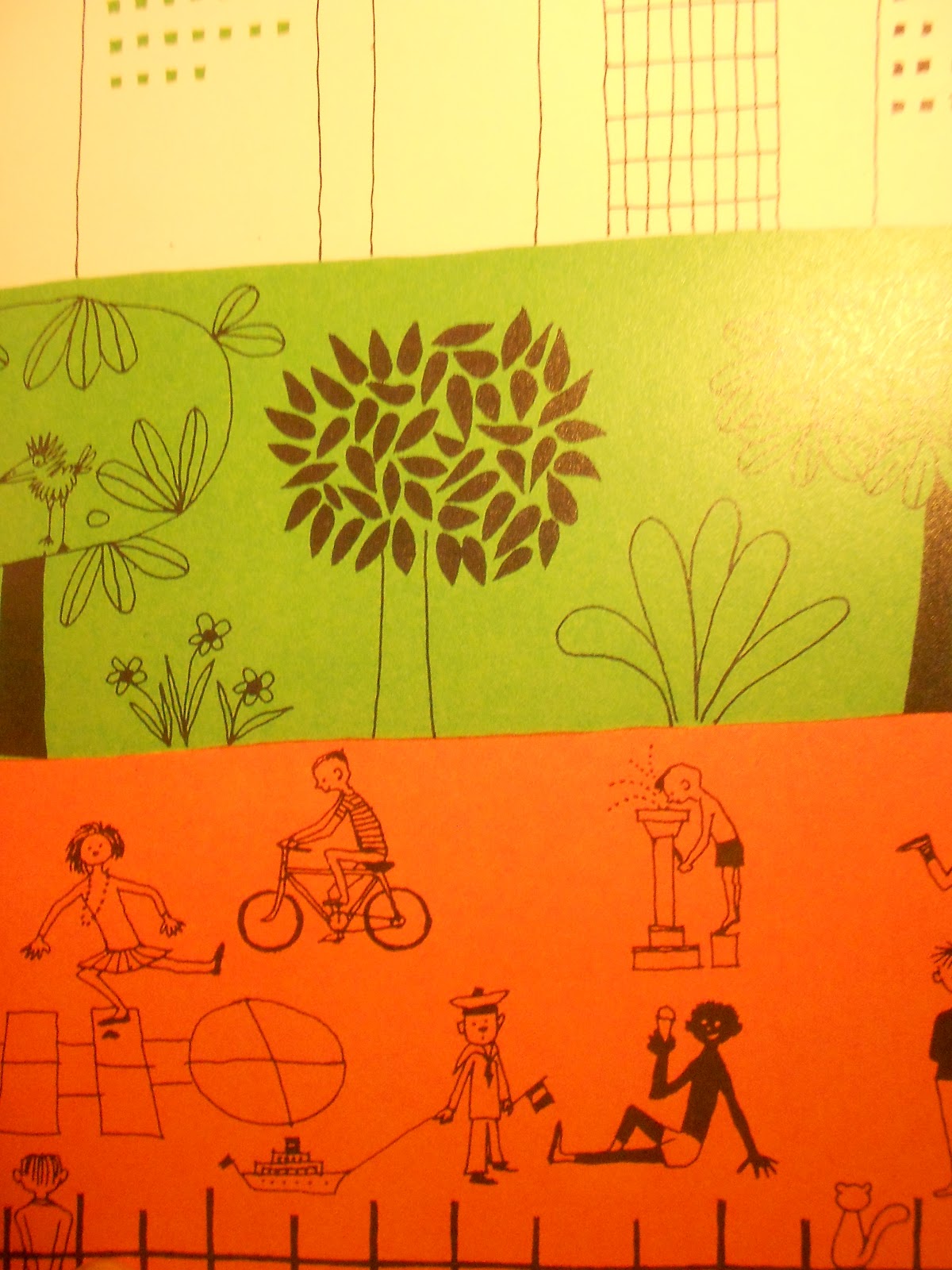
A Swedish graphic designer Olle Eksell. My new book just came in the post full of stuff, from book sleeves and posters to pattern design. Yet again pictures not doing justice, perhaps I should try and get my scanner working!
I like the contrast in Eksell's work between the black line and patterned areas and the edgeless block colour – not feeling the need to colour everything in. As I do not speak swedish I may perhaps miss some of the gags, though still pretty to look at and touch the contrasting papers, and smell its newness!
Subscribe to:
Posts (Atom)