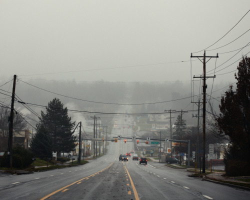
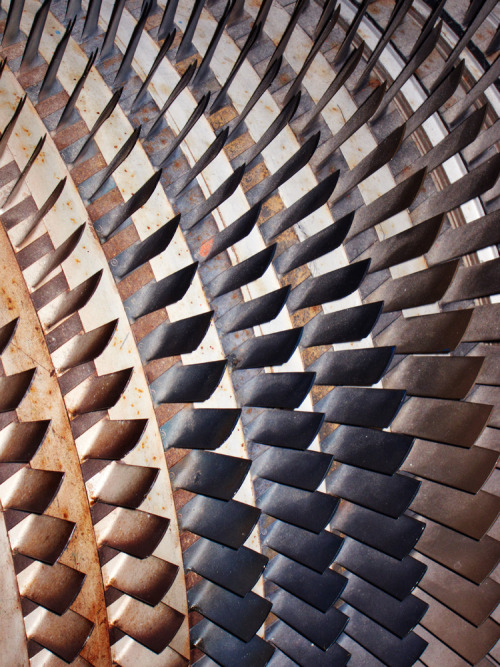
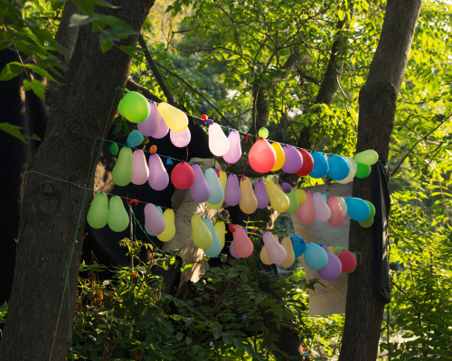
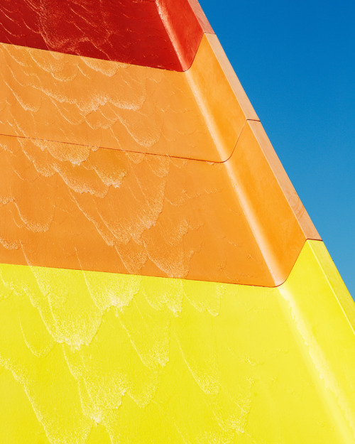
I loved looking at Prior's blog, here are some photos from his blog and website. The blog is like a photographic diary, often images that capture textures, shapes and moods during travels.
I was looking at the arts/culture/lifestyle blog weheart.co.uk and saw the post about duo Kai and Sunny project "Caught by the Nest." 's calaboration with graphic artist Shepard Fairey (Obey). 'This series of pieces looks at elements of the natural world through an abstraction of geometrical patterns, rendered in impressive large-scale installations and screen prints infused with copper and “stardust”.' -WeHeart The project is inspired by 'The reason I Jump' a Japanese novel by Naoki Higashida (translated by author David Mitchell) which tells a story of an autistic teenager who finds comfort in nature. 'The pair has joined forces with graphic artist extraordinaire Shepard Fairey on two versions of an image in which the central core of Shepard’s “Obey” star bursts outwards in a flower pattern. As Shepard says the luminosity of the metallic pigments needs to be seen in person.'-WeHeart I love the variety of tone that is built up in these prices, whilst still being black and white images as opposed to grey scale. I think this, along with the sharp, graphic style makes for bold, high impact pieces.
We are currently working on a live brief to design an identity for a new auction house. I came across these logos in the book 'No Rules Logos by John Stone.' I have decided to try out my own ideas for a varying logo which will include many objects found in an auction house. Obviously this type of logo will be a challenge to create as it will still need to be recognisable. At the moment I am thinking of working around a circle as a base and figuring out a style appropriate for all of the variations. I think the idea has potential for GIF images and categories when I take my idea onto some web layouts and stationary.
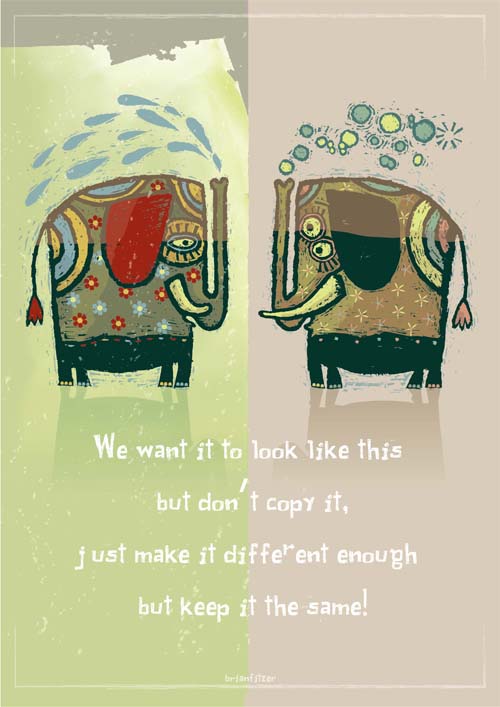
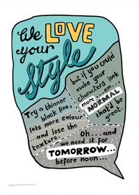
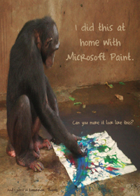
Frustrated by their clients, Irish graphic designers Mark Shanley and Paddy Treacy decided to turn their “favorite worst feedback” into posters. www.sharpsuits.net
I am looking at infographic animations for ideas on tone of voice and aesthetic for my animation. I am also interested in the way one screen can merge interestingly into the next screen and a new pocket of information.
Loud Voices pt. 1 - Laguna San Ignacio
I have selected this video as I like the visual aesthetic. It is a quite slow paced (slower than the animation I imagine creating) however the camera moves across the scene to show different pockets of information. I like the fact the type pops like bubbles underwater. It becomes part of the animation rather than an overlay.
This animation has a really interesting flow. Things spin, pop, bounce and slide in and out of the frame and objects transform into one another. The circular axis that has been created in the centre not only allows things to spin around it; elements are able to shrink into the centre and expand into something else. The animation has a happy positive feel to it, however, it is in a foreign language so I cannot tell how the information relates to the image.
Herman Miller - This is You
I have seen this animation before so it must have stuck in my mind. It is really simple and effective. Elements in the image have a cut out, rough-edged feel making it seem personal. This is appropriate for the theme of the video which focuses on the audience - 'you' - making oneself better off by coming to work for Herman Miller. This also gives the animation a feeling of eco friendliness which is also raised within the clip. There is a repeated use of the word 'this' as simple objects flash into view which seems to work. The movement within mimics the speed and tone of the voiceover- an important thing to think about.
This is another self promotion video like the Herman Miller video above. Instead though, cleaner lines are used and digital text. This reflects the fact it is a design company, focusing on the digital. The camera pans in the clip which again makes each piece of information flow on from the last. It creates a sense of dynamic as although it is the camera that panned, the text seems to be on its side. Through all these videos (perhaps excluding the first) I notice a sense of rhythm. Slowing things down and speeding them up again creates interest. 'This is Dare' is full of facts and figures which have been made visual and therefore interesting through kinetic typography, symbols and illustrations.