Feminist Project Features Morbid Depictions Of Common Beauty Rituals
Monday, 17 March 2014
Friday, 14 March 2014
Kate Moross
Graphic Designer Kate Moross is who I have been looking at today.

Moving Image:
Branding:
Monday, 3 March 2014
Art Direction/Photography Inspiration
Adi Goodrich, set design and art direction, collaboration with JUCO.
These images stood out due to the bold use of colour that creates a connection between the models and their environment. In addition to this, the backgrounds depict patterns which contrast the position of the models bodies. For example, image two shows fluid lines in the background, opposing the angular shape created by the model.
Photographer, Pauline Darley
TONE
MOVEMENT
COMPOSITION
The image below is from a project, "16 and pregnant." The photograph creates a youthful, childlike image of the 16 year old, (Alice in Wonderland in style), in order to emphasise the shock of the young pregnancy. The series is playful taking a humorous angle on the serious subject, one image showing the girl with a balloon under her top to create a pregnancy bump. The girl appears to be enjoying her childhood and suddenly it is over.
Wednesday, 15 January 2014
Colours and Textures - Amelia's Anthology of Illustration
The images below are all illustrations I really liked from a library book I found lying around in the studio, "Amelia's anthology of illustration." I am particularly interested in the use of scanned textures and the use of colour in these as I am looking to work with stronger colour combinations in upcoming projects.
Thursday, 21 November 2013
Developping a Logo / Hand Drawn Type
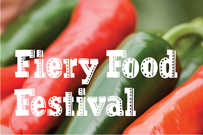
In this project I will create the branding for a fictional chilli festival. The project gives me the potential to create all sorts of promotional material and items for the festival itself, including, a logo,website, tickets, banners, merchandise etc. As the subject matter relates to food I wanted to try a natural image for the branding which will showcase a 'local' festival.
I came up with the idea of using hand drawn type. I began by copying a few words of a slab serif typeface and creating Mexican style pattern over the text. I then scanned it in and cleaned it up in Illustrator. (Image 1)
A recent blog post I made shows a food poster which had a chopping board as the central point. I took this as inspiration and experimented with combining a wooden texture, along with my photographs and hand drawn type. (Image 2)
As a result of this I decided to use Clarendon as a base for a full typeface so I traced over the lettering and added patterns. Again, I cleaned this up in Illustrator. (Image 4 & 5) Finally, I combined the ideas and played around to design a logo for the festival. (image 6 & 7)
Tuesday, 19 November 2013
The Art of Being Odd
This was a small project which could be ongoing. I thought of personality/physical traits about myself and had to make one of those visual. The idea is to get us thinking about ways to make ourselves stand out in the industry by discovering "what makes me, me?" or "what makes me odd?"
I chose to visually show the fact that I am always asking questions, my desire to know more. I create some hand drawn type to make the piece feel personal.

I chose to visually show the fact that I am always asking questions, my desire to know more. I create some hand drawn type to make the piece feel personal.

Wednesday, 13 November 2013
Quentin Jones
I have looked back at some old posts and unfortunately some of the links to images I have previously used when blogging have been changed. So I got looking at Quentin Jones and again and have found some stuff I haven't seen before. There are also some interesting moving image work on her website: www.quentinjones.info/work
Subscribe to:
Posts (Atom)


