Wednesday 7 December 2011

Event Posters, getting ideas...


Designed by Tom Eckersley for an exhibition with the tag-line: How they brought the world to the West Coast.
I like the way the sea and sky are one, the horizon being defined by the land mass in the background. Notice the weight of the line between the beach and sea getting thinner in the distance; this is a good way of giving the picture depth whilst still keeping the simple flat colour. The white boat is also essential to the composition as it draws the eye back in to the image and breaks up the large amount of blue. The blue underlines in the bottom left also balance out the colour making it look less top heavy.


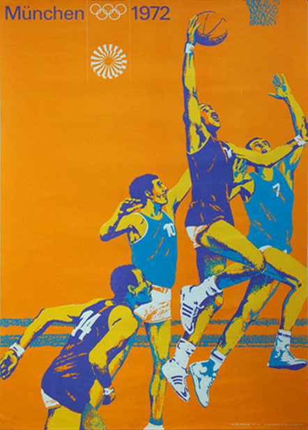
Designed by Otl Aicher for the Munich Olympics, 1972. Part of a series.
I have been interested in how I can eventually make my ideas into a set of four rather than individual pieces that don't sit well together. Here Aicher has used the posterized style of the photographs to give the posters consistency. The same font is used for each poster and although the colours change, the is a limited palette on each. The same shades are also sometimes used from one poster to the next adding to the consistency and the Olympic rings are kept a single colour as to not distract the viewer.
I like how each poster conveys the mood of the particular sport. In the first one the lines in the back ground as speed to the cyclists. In the second the shadows on the arms elongate them and exaggerate the arms extention giving the feeling of desperation to get the ball. The juxtaposition of the bodies combined with the bright colours additionally shows the energy of the moment. The third image contains much more stable shapes within its composition, for example the rectangular block colour for the body of the Archer. Again this reflects the sport shown.

Wednesday 16 November 2011

Information Graphics

From informationisbeautiful.net (David McCandless amongst others) given on the brief, theres a few really good examples of showing really complex things simply on here, getting carried away learning about all sorts!

Wednesday 9 November 2011

Peacock Blue

Finding it hard to recreate the vibrancy of the blue on a peacock. 100 variations on a theme is taking a while...

Tuesday 25 October 2011

Perspective


Masaccio - St Peter healing the sick with his shadow 1427-1428
One of the early paintings showing perspective. Usually the brick work would be a great indicator of the horizon line, however here the brickwork is uneven so it leaves no accurate clue. Took what I saw to be parallel lines to find the vanishing point and therefore the horizon line. This lead me to discover that the painter was about average height and stood up whilst painting as the other peoples eyes all sit just around the horizon line.


Giovanni Paolo Pannini- Gallery of Views of Ancient Rome 1758
This one was a really tricky one because the room is in such a mess barely anything is parallel! I did discover that perspective was used in the distancing between the picture separations at the back though (fencing technique).

Wednesday 12 October 2011

Swiss Graphic Design - Richard Hollis (Book) (More to follow)


Zurich Artists in the Helmhaus poster by Richard Lohse 1950

COMPOSITION AND COLOUR:

Here the use of colour draws the eye back when otherwise the text would take you off the page. For example, when reading the text upwards you reach the red block which not only acts as a visual block to stop the eye leaving the page but also leads your eye back to the red at the bottom.

The red box surrounding the text at the bottom draws the eye back in to the left.

The text position in the top right hand corner stops the image being too heavy at the bottom left of the page by balancing it out.

Red and green create great contrast.

(Supposed to be bullet points but wont work!)

Stefan Sagmeister - Things I Have Learned


Stumbled upon this in the library whilst looking for books about colour last week, yet it fits in nicely with the Tactile lecture we were given yesterday.

I found it interesting initially due to the format; a sleeve containing around 15 small inner booklets. Each booklet has a different cover which if placed at the front, can be revealed by the cut out holes of Sagmeister's face featured on the sleeve. The booklet covers vary largely, from a photograph of a acne covered back to an illustrative pattern of a lizard caught up in a pineapple plant! The booklets have no chronological order as they are simply "Lessons" shown through typography, photography and more. This makes the cover interchangeable.

Worrying solves nothing


Cleverly created using 25,000 black and 35,000 white coat hangers. "Four hangers were bound together with wire fasteners to form a square; six of these completed squares formed a cube; and the cubes in turn formed pixels". Each letter is 10 feet high and the sentence measures 125 feet.

Drugs are fun in the beginning, but become a drag later on

Here the lesson was revealed page by page.


Friday 23 September 2011