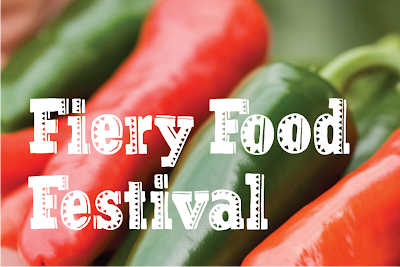
In this project I will create the branding for a fictional chilli festival. The project gives me the potential to create all sorts of promotional material and items for the festival itself, including, a logo,website, tickets, banners, merchandise etc. As the subject matter relates to food I wanted to try a natural image for the branding which will showcase a 'local' festival.
I came up with the idea of using hand drawn type. I began by copying a few words of a slab serif typeface and creating Mexican style pattern over the text. I then scanned it in and cleaned it up in Illustrator. (Image 1)
A recent blog post I made shows a food poster which had a chopping board as the central point. I took this as inspiration and experimented with combining a wooden texture, along with my photographs and hand drawn type. (Image 2)
As a result of this I decided to use Clarendon as a base for a full typeface so I traced over the lettering and added patterns. Again, I cleaned this up in Illustrator. (Image 4 & 5) Finally, I combined the ideas and played around to design a logo for the festival. (image 6 & 7)


No comments:
Post a Comment