Above: Panera had recently reduced the amount of time the food took from farm to table. The brief was to "communicate freshness without relying on a dry fact based shell." TOKY Branding had the idea "The Return of Summer."
The use of colour here really communicates the freshness and reminds us of summer fruits/salads. The typography is letterpress or letterpress style print, it gives it a personal, hand rendered feel as though the same attention is put on preparing the food/drinks.
Below is a collection of spreads from AS IF Magazine's premier issue. I have chosen them as I love the cross between photography and illustration here. The textures layered over the images add depth and a sense of magic almost. Design Firm: IF studio.
Below is the type for an editorial spread about a man who had been burnt in a fire. The textured type entwined with smoke captures the subject matter.
This below is for Members Magazine. This is particularly relevant to my current project for ISTD. The objects are cleverly turned into typographical pieces that represent the objects. The colours are reflected as are the shapes and the general feeling of the images i.e feminine oriental, geometric, warm.

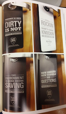
Below: "To combat the hotels rising energy costs from cleaning and water, Hard Rock Hotel San Diego tasked MiresBall with designing a program that was accessible, memorable and in sync with the hotel's edgy brand."-Design Annual. The design here is bold and humorous appropriate for the audience. The white and black not only matched the colour scheme of the rooms but made it easier for the mades to spot who wanted their rooms cleaned.

PACKAGING
All of the examples below are from a digital arts communication design magazine. Unfortunetly I do not have the names of all the designers here.
Below: Ortiz Design (design firm)
TAXI Canada Ltd (ad agency) below
AESTHETIC (below) - I just pulled this one out because I found it interesting to look at.


No comments:
Post a Comment