
Tom Gauld

Here the light reflections on the trees and ground are done by working in reverse white on black. I love the contrast between the textured detail and the crisp white figures in the image that mirror the style of the moon. This makes the whole thing feel surreal which is appropriate for ghosts.
John Held Jr.
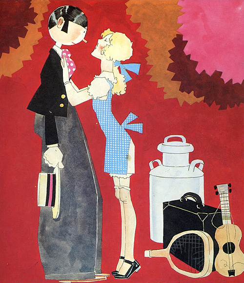
I chose this image as I like the contrast between the flat colour and the washy colours. I like the jagged edges and the fact that in some areas perspective and shading makes the image have depth while in others the flat colour makes it seem two dimensional.
Adrian Johnson

Screen printing and how the the colours create other colours as the ink is laid on top - interesting.

Another screen print, here with the imperfections of the print left in. I like the ever so subtle reflection on the ground which only exists as it is raining and there are puddles. This aids the central theme of the image without actually having to drawing a miserable day in the background and puddles on the floor. The exaggeration of how small the umbrella is emphasises just how bad this guys day is going!
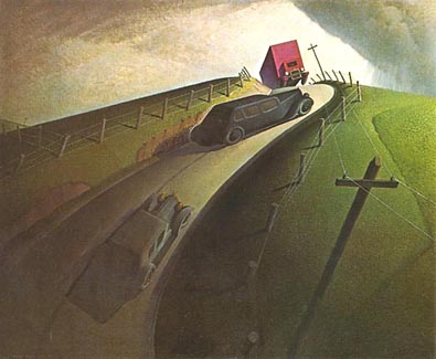
Grant Wood
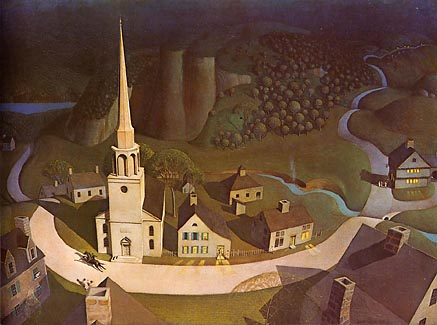
Love the use of light on both of these. The warmth of the colours in the images is apparent despite them not being filled with reds and oranges.
No comments:
Post a Comment