Not sure if this will be visible in large upon posting but I am looking at ways of getting my scale into one image. This one gives some sort of corporate scale in a visually interesting and humourous way. From Udemy.
This one shows information on types of Pedestrian deaths in new Jersey. I like the layout and how the type and imagery is used make you want to find out what that certain section relate to rather than avoid reading/ dismiss them. By InfoNewt.
Peter Grundy
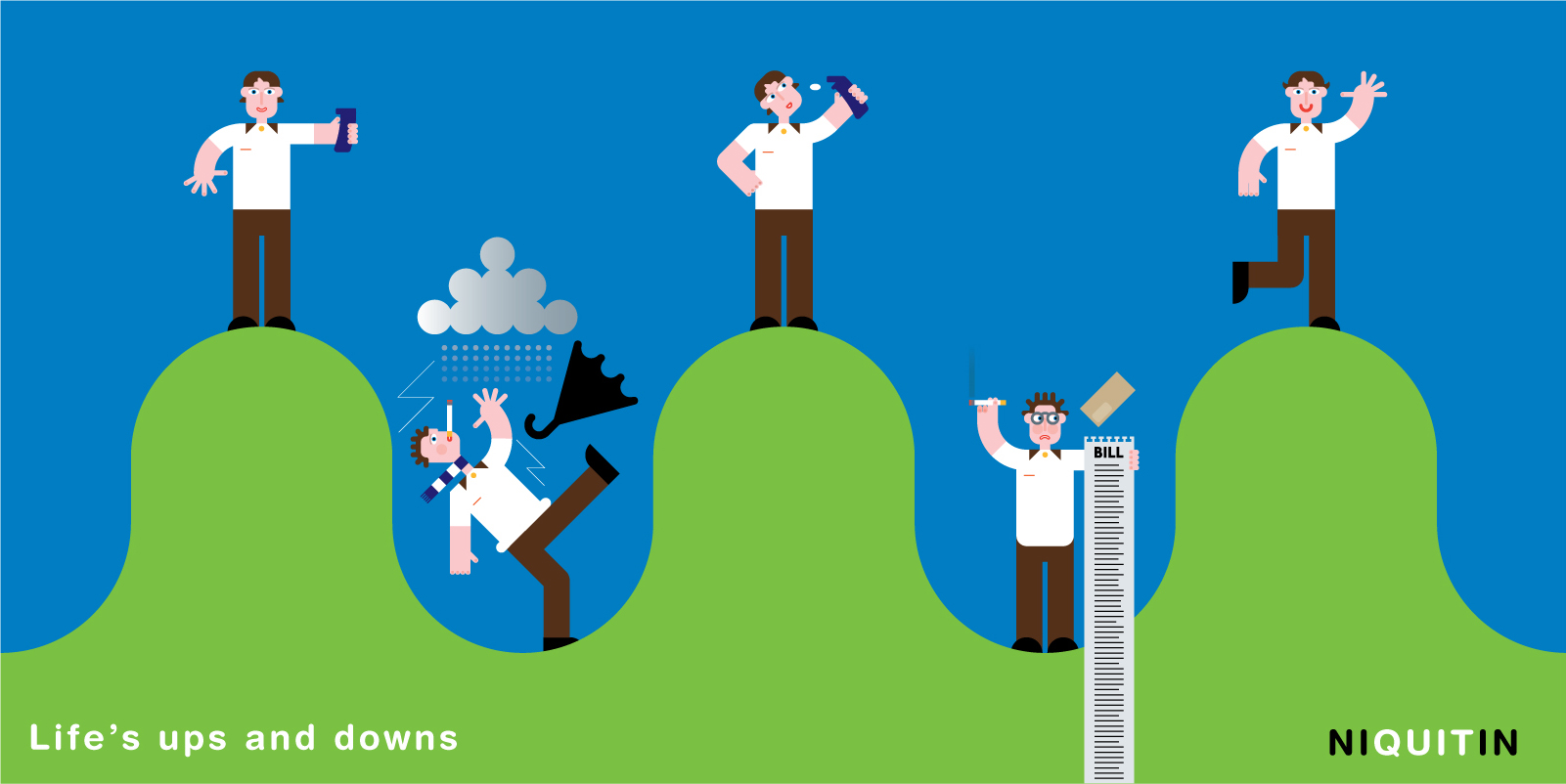
A little illustration of lives ups and downs for Niquitin. I like the style of drawing here and how the five separate images are made into one. I also like the boldness of the colours, the proportion particularly in the hands is out making the work playful and how the bill brakes down to the bottom of the image so it is not too rigid.
A lot more going on here so the shapes are simplified to stop it getting confusing. I prefer the more simple images in the first work for Niquitin but I think its something worth baring in mind. I think the black line also is a bit clunky for the style I want my work to follow. I'm unsure what this piece of work is about but the Tagline is "you never know who you might be travelling with" and I think it is pretty funny as you can relate to it.
Add to encourage people to cycle – again trying to look at styles for my work.


No comments:
Post a Comment