Tuesday, 25 October 2011

Perspective


Masaccio - St Peter healing the sick with his shadow 1427-1428
One of the early paintings showing perspective. Usually the brick work would be a great indicator of the horizon line, however here the brickwork is uneven so it leaves no accurate clue. Took what I saw to be parallel lines to find the vanishing point and therefore the horizon line. This lead me to discover that the painter was about average height and stood up whilst painting as the other peoples eyes all sit just around the horizon line.


Giovanni Paolo Pannini- Gallery of Views of Ancient Rome 1758
This one was a really tricky one because the room is in such a mess barely anything is parallel! I did discover that perspective was used in the distancing between the picture separations at the back though (fencing technique).

Wednesday, 12 October 2011

Swiss Graphic Design - Richard Hollis (Book) (More to follow)


Zurich Artists in the Helmhaus poster by Richard Lohse 1950

COMPOSITION AND COLOUR:

Here the use of colour draws the eye back when otherwise the text would take you off the page. For example, when reading the text upwards you reach the red block which not only acts as a visual block to stop the eye leaving the page but also leads your eye back to the red at the bottom.

The red box surrounding the text at the bottom draws the eye back in to the left.

The text position in the top right hand corner stops the image being too heavy at the bottom left of the page by balancing it out.

Red and green create great contrast.

(Supposed to be bullet points but wont work!)

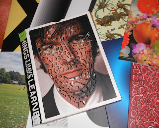
Stefan Sagmeister - Things I Have Learned


Stumbled upon this in the library whilst looking for books about colour last week, yet it fits in nicely with the Tactile lecture we were given yesterday.

I found it interesting initially due to the format; a sleeve containing around 15 small inner booklets. Each booklet has a different cover which if placed at the front, can be revealed by the cut out holes of Sagmeister's face featured on the sleeve. The booklet covers vary largely, from a photograph of a acne covered back to an illustrative pattern of a lizard caught up in a pineapple plant! The booklets have no chronological order as they are simply "Lessons" shown through typography, photography and more. This makes the cover interchangeable.

Worrying solves nothing


Cleverly created using 25,000 black and 35,000 white coat hangers. "Four hangers were bound together with wire fasteners to form a square; six of these completed squares formed a cube; and the cubes in turn formed pixels". Each letter is 10 feet high and the sentence measures 125 feet.

Drugs are fun in the beginning, but become a drag later on

Here the lesson was revealed page by page.