Monday, 29 October 2012

Volt Magazine

For my art direction/editorial work I have been working on a fashion piece. I have been looking at Volt Magazine for its great covers that give the dramatic feeling I want to achieve. I will also post some photographs from an editorial piece which really stood out. 

Covers


Photographs by Tom Andrew
Using light to express form and create bold contrast. 


Monday, 13 August 2012

Thinking of winter already

Knitted myself this last week, next for a hat! 


Mixed Media

Got the day/morning off work whilst I wait for the postman. Been looking at these fascinating editorial pieces created by Quentin Jones. The first two are a collaboration with Rankin for The Hunger Magazine and the two that follow are a pull out cover for Nylon Japan. The work is playful and shocking (or more surprising.) The models are often used to create angular shapes and/or crisp edges which contrast some of the fluid brush marks and typography. 

On the second image down the photographer has captured the curves of the model, also adding to the dark curvy silhouette with collaging. In this instance the typography creates the angular contrast with its cut-out block style. It sits nicely with the curves as it has been cut out from a very curvy pattern and the subtle flicks of blue within the image keep with the blue in the pattern. In terms of colour in general in these pieces, I love the use of neutral (but not grayscale) colours which are thrown off with a bolder colour or two which really stand out.


Wednesday, 1 August 2012

Mark Addison Smith

I came accross Mark Addison Smith's blog youlookliketherighttype.com where for four years the designer has documented overheard speech once every day in his sketchbook using typography and illustrations - often with a sense of humour. A few examples I will post below.The designer also does some interesting artist books: http://markaddisonsmith.com/artists-books


Thursday, 5 July 2012

Type

Tom Carnase

Type designer known for designing the typeface Avant Garde alongside Herb Lubalin and and the logos for Calvin Klein, Revlon and Brooks Brothers. 

I particularly like the piece above with the lettering almost dancing across page; the fine swirls ensuring not too much white space is left. The type on the word "eighty" would seem heavy if it weren't for the extremely fine strokes which contrast the bolder ones. This variation in stroke mimics the typeface on the left meaning they fit well together. Very feminine. 

Above the letters are cleverly positioned so that they flow into one another. This makes the type look more like a picture which catches the eye by creating both interesting positive and negative space. The viewer is drawn in by the filled counter of the "O" possibly reading the type after looking at the type as a whole.


The logo above is very dynamic with its strong underline and bar of the F combined with the italic type.  The choice of the black background with white texts steadies the lettering and holds it all together.

More femininity.

Cafeteria - CBS building

In 1966 a 35ft by 8ft wall was designed and crafted by Lou Dorfsman with Herb Lubalin and Tom Carnase in the cafeteria of the CBS building, New York. The wall consisted of varied typefaces; carved from wood; listing the types of foods available to customers. The wall was removed in the 90s.

I love how the 3D type gives texture and shadow. It makes it readable all in white as colour would have been too busy with so many typefaces. The variation can sit so well together as each piece of type fits snugly within a unique box. The combination of vertical and horizontal text, square and rectangular spaces add even more interest/variation.

Tuesday, 15 May 2012

Junk Food Patches

A spoof add created by Corpus Light. A way of killing those cravings by adding a patch, (similar to a nicotine patch but for junk food) and drinking a Corpus Light drink. I like the humour here, shows the company are fun and it gets the right market as many people (most likely women) who drink the Corpus Light are likely to be drinking it for health reasons. It allows people to laugh at themselves.

Tuesday, 13 March 2012

My final 8 Degrees Piece

My given subject was hairdryers so I took the idea of alternative hairdrying methods. The scale goes 
from the "limp and lifeless" airdry to a "you're worth it" head in the oven.


Photographing a Video Tape

A few photographs from todays session where I destroyed and rebuilt a video tape. I think the aim was to edit the images in different ways to give variety.


Sunday, 11 March 2012

Bits of advertising

An A board for a Karate school. 

And this can be found in Switzerland, not really very pretty but it still made me smile. 

Business Cards

A few clever little business cards I liked from a post on www.youthedesigner.com

Pilates Studio


This business card is also a seed, instructions on the card read to copy his details into your address book, plant the seed and when the flower grows send him a picture. Idealy the flower would be a reminder in the back of your mind about that contact, if not, it may just make a smile!
AND the joinery card that's made out of wood. What else?


Friday, 2 March 2012

Inspiration for my 8 degrees


Not sure if this will be visible in large upon posting but I am looking at ways of getting my scale into one image. This one gives some sort of corporate scale in a visually interesting and humourous way. From Udemy.
This one shows information on types of Pedestrian deaths in new Jersey. I like the layout and how the type and imagery is used make you want to find out what that certain section relate to rather than avoid reading/ dismiss them. By InfoNewt.

Peter Grundy
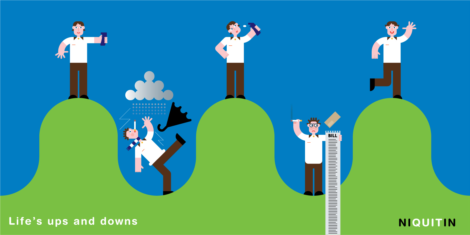
A little illustration of lives ups and downs for Niquitin. I like the style of drawing here and how the five separate images are made into one. I also like the boldness of the colours, the proportion particularly in the hands is out making the work playful and how the bill brakes down to the bottom of the image so it is not too rigid.
A lot more going on here so the shapes are simplified to stop it getting confusing. I prefer the more simple images in the first work for Niquitin but I think its something worth baring in mind. I think the black line also is a bit clunky for the style I want my work to follow. I'm unsure what this piece of work is about but the Tagline is "you never know who you might be travelling with" and I think it is pretty funny as you can relate to it.

Add to encourage people to cycle – again trying to look at styles for my work.